Research
The magazine' logo as well as the name of their prestigious film festival is placed in the top third so that it is recognized by the audience. The magazine does not have a central image, however an image from a featured film is used as part of the typography. This is different to typical film magazine covers as it helps the audience understand that the institution revolves around arthouse cinema. The color scheme is quite bright as it uses an over exposed image in the typography. This along with the white text and black background gives the cover of the magazine makes it look bold and striking, which appeals to the audience and draws their attention to the image placed within the typography. The various fonts used are also quite similar, which makes the cover look tidy and formal. Other aspects such as dates and sponsors are also used to attract the ''loyal audience'' - they may be familiar with the sponsor. The magazine uses 4 of the 12 arthouse conventions which therefore suggests that its aimed at a an audience that enjoys arthouse cinema.
Everyman Cinema
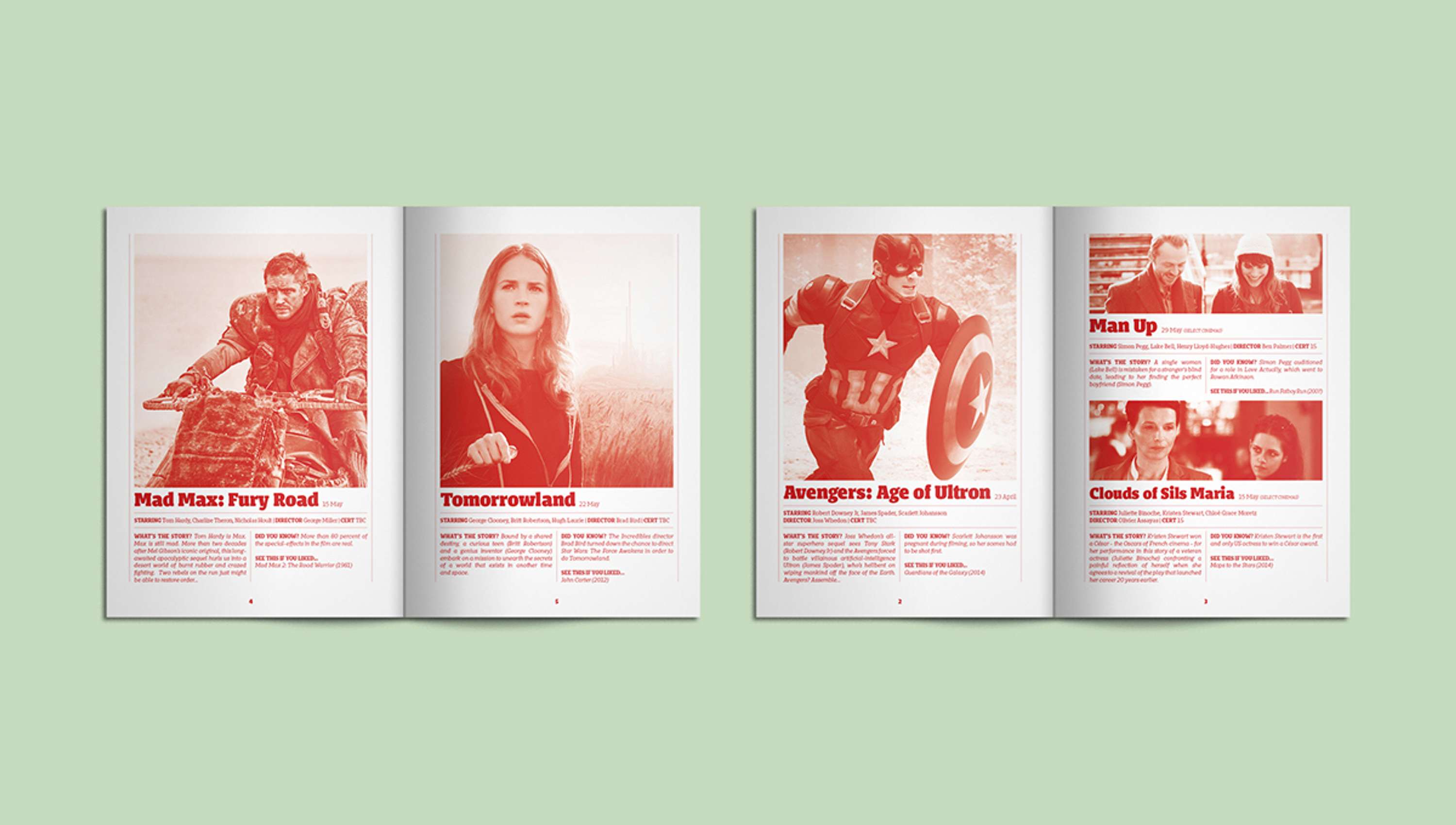
I like how the colour of the text and images is the same. It gives it an interesting look as it gives out a certain ''vibe''- most of the movies that are featured are action movies, therefore the ''red colour scheme'' could connote danger and energy. The images take up most of the space on the page - which is common in arthouse film magazines as the audience are interested in the visual iconography, which helps them determine what genre the film is. The overall look is quite tidy and simple which is something I would like to adopt when making my magazine.
Curzon Cinema

The title of the publication is written vertically on the magazine, which shows us that the cinema mostly caters to arthouse films. I could use this in my own print work to show the audience that my film is part of the arthouse genre. I also like how there is a limited colour scheme.
In this magazine, the image of the character takes up most of the first page, which gives the publication a bold striking effect. I also like how a silhouette of the cityscape is used on the side of the image to reveal the setting of the narrative. I could use this design in my own print work as the setting for a scene in my production is filmed in near an estate.
Firehall Arts Center (1991)
This magazine uses several action shots (of over exposed images) which I think is common in arthouse film magazines. It allows the audience to get a ''sneak peak'' at the different scenes that they might see in the film. I could use this for my magazine as my arthouse production also include some action scenes that would interest the viewer.
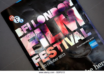
BFI London Film Festival

I like how the image of the man is split up to show the different characters. This is an interesting idea as it allows the audience to determine the genre of the film (by looking at the costumes). I also like how there is a short/catchy slogan to grab the readers attention and sum up the experience of viewing films at that particular cinema.

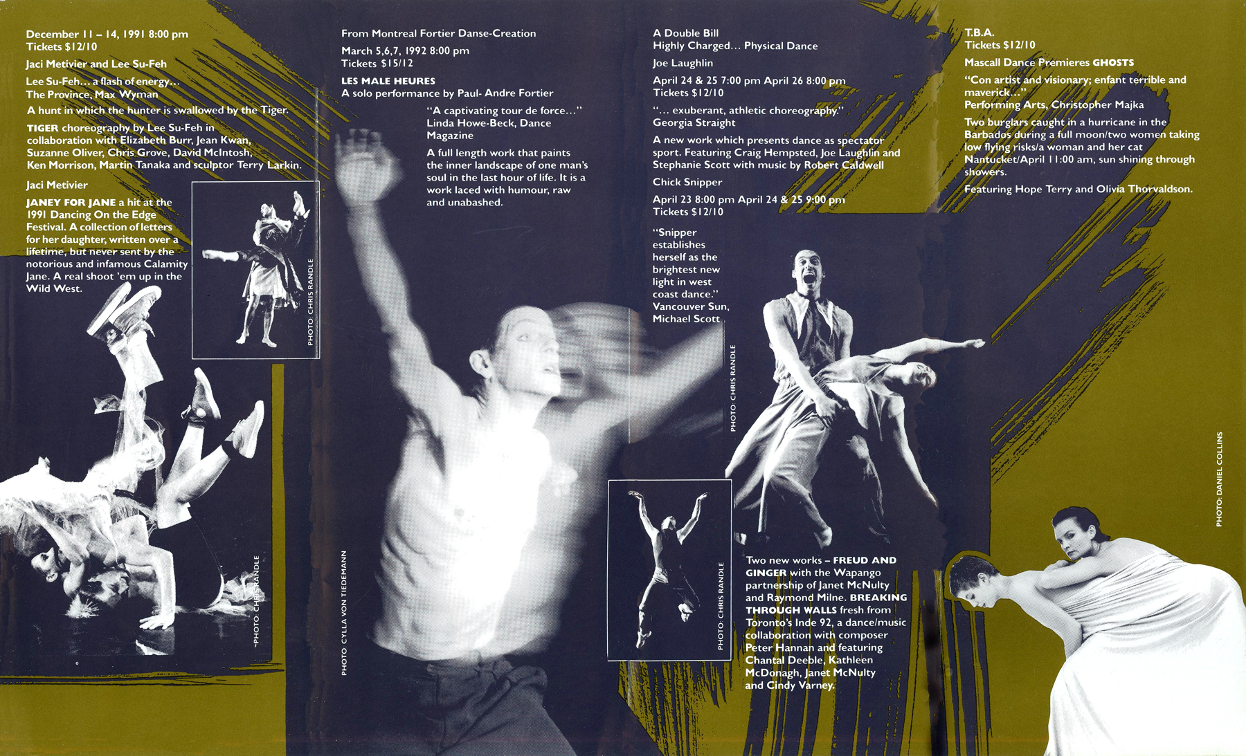
The images are all centrally placed to give it a neat and simple look, however not all the images are straight. This makes it appear as if its a scrapbook or collage of some sort which is an interesting design. I also like how the text is written on both sides- which almost looks mirrored- this allows the viewer to easily navigate their way through the images and headings.

The image is placed in front of the title to make it look bold and appealing to the viewer.The colour scheme consists of striking colours such as red, black and white. The limited colour scheme allows the reader to view the text clearly.
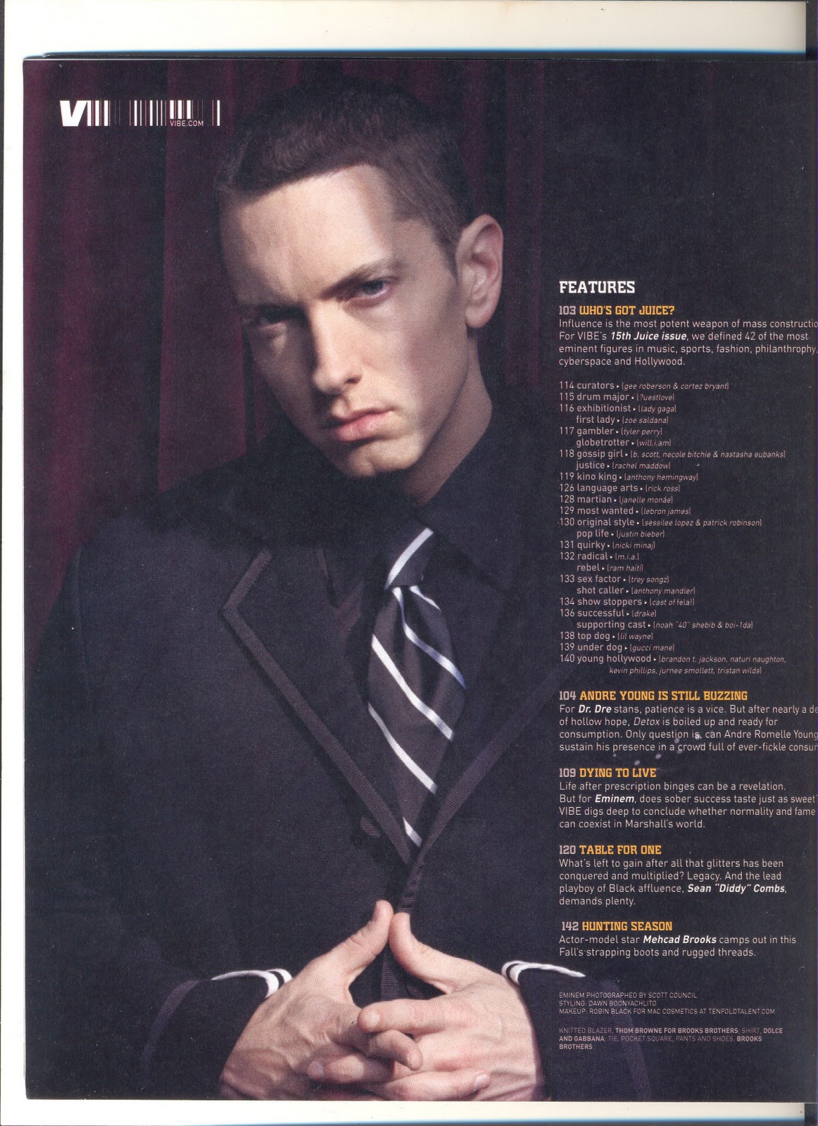
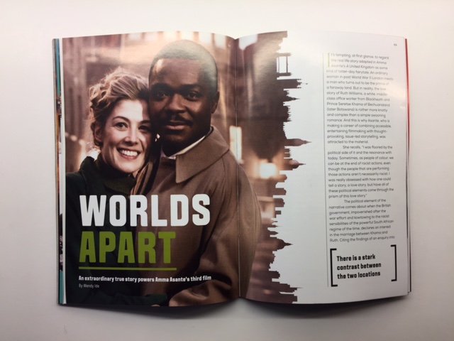
In this magazine the central image shows the audience what the dominant feature is- in this case the main article that the viewers would go to would be about the rapper, Eminem. The text is written in a small font size to highlight the significance of the image. The alignment of the text also makes the magazine look neat and professional. The image is also edited to make it the setting look dark- this allows the text to stand out.
The monochromatic colour scheme makes it looks old-fashioned. The black and white images could also suggest that the film is set in the past or includes flashbacks. I could use this in my print work as my production also includes flashbacks. The features are written in the same format as songs on albums - this could possibly suggest that the production includes several soundtracks to assist the visuals.

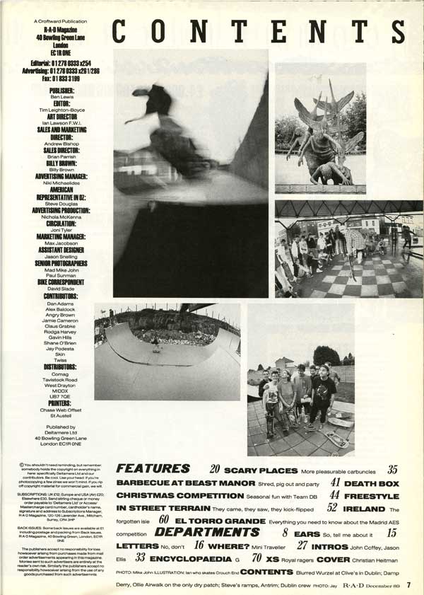
I like how the word contents is split up on both pages and mixed up (in terms of order of display). It could suggest that the films that are featured are non- linear narratives. I could use this design as my narrative also plays with time.
Produce an A5 sketch of your front cover including the key conventions and design tricks you have studied in existing programmes and then planned in planning task 1 above.


Everyman Cinema
I like how the colour of the text and images is the same. It gives it an interesting look as it gives out a certain ''vibe''- most of the movies that are featured are action movies, therefore the ''red colour scheme'' could connote danger and energy. The images take up most of the space on the page - which is common in arthouse film magazines as the audience are interested in the visual iconography, which helps them determine what genre the film is. The overall look is quite tidy and simple which is something I would like to adopt when making my magazine.
Curzon Cinema

The title of the publication is written vertically on the magazine, which shows us that the cinema mostly caters to arthouse films. I could use this in my own print work to show the audience that my film is part of the arthouse genre. I also like how there is a limited colour scheme.
In this magazine, the image of the character takes up most of the first page, which gives the publication a bold striking effect. I also like how a silhouette of the cityscape is used on the side of the image to reveal the setting of the narrative. I could use this design in my own print work as the setting for a scene in my production is filmed in near an estate.
Firehall Arts Center (1991)
This magazine uses several action shots (of over exposed images) which I think is common in arthouse film magazines. It allows the audience to get a ''sneak peak'' at the different scenes that they might see in the film. I could use this for my magazine as my arthouse production also include some action scenes that would interest the viewer.
BFI London Film Festival
I like how the image of the man is split up to show the different characters. This is an interesting idea as it allows the audience to determine the genre of the film (by looking at the costumes). I also like how there is a short/catchy slogan to grab the readers attention and sum up the experience of viewing films at that particular cinema.
The images are all centrally placed to give it a neat and simple look, however not all the images are straight. This makes it appear as if its a scrapbook or collage of some sort which is an interesting design. I also like how the text is written on both sides- which almost looks mirrored- this allows the viewer to easily navigate their way through the images and headings.
The image is placed in front of the title to make it look bold and appealing to the viewer.The colour scheme consists of striking colours such as red, black and white. The limited colour scheme allows the reader to view the text clearly.
In this magazine the central image shows the audience what the dominant feature is- in this case the main article that the viewers would go to would be about the rapper, Eminem. The text is written in a small font size to highlight the significance of the image. The alignment of the text also makes the magazine look neat and professional. The image is also edited to make it the setting look dark- this allows the text to stand out.
The monochromatic colour scheme makes it looks old-fashioned. The black and white images could also suggest that the film is set in the past or includes flashbacks. I could use this in my print work as my production also includes flashbacks. The features are written in the same format as songs on albums - this could possibly suggest that the production includes several soundtracks to assist the visuals.
I like how the word contents is split up on both pages and mixed up (in terms of order of display). It could suggest that the films that are featured are non- linear narratives. I could use this design as my narrative also plays with time.
Planning and sketching
Create a spider diagram or bullet point list of all the things your target audience might be interested in. How can you use this information to create a main feature about your film that will appeal to your target audience?
- Information on upcoming films
- Exclusive content - interviews from actors or film production stories
- Competitions and offers
Produce an A5 sketch of your front cover including the key conventions and design tricks you have studied in existing programmes and then planned in planning task 1 above.

Produce an A4 sketch of your double-page spread contents page. In terms of the text for your contents page, you will need to find out the names of the films of other groups in your class. The other films in the class will make up the rest of your contents page.

Produce an A4 landscape sketch of your double page spread design now you have chosen the subject matter.

Photoshoot
1) Which of your main characters will appear on the front cover of your programme?
1) Which of your main characters will appear on the front cover of your programme?
My character (Aisha), and also Nasteha's character (Noora) will appear on the front cover. I think that having both the antagonist and the protagonist will help the audience understand the narrative and figure out its genre (through the use of costume and make up).
2) What image or images do you need for the contents page?
2) What image or images do you need for the contents page?
A screen grab of the scene in the park where Aisha is in her hideout. The image should have low key lighting as I want the audience to figure out the location in the production. The image will be of Aisha siting down writing a note. I could also have another image of me looking out into the park (view from my hideout)
3) What image or images will you use for the double-page spread?
3) What image or images will you use for the double-page spread?
- Salma's Character waiting in front of the estate with her phone in her hand.
- Close ups of the notes that Aisha's character writes
- Polaroid photos of Noora and Aisha.
- Photo of Noora and Salma (Photoshoot)
4) Write a shot list for the photoshoot. Make sure you plan a variety of camera shots you will look to capture - medium shots, close-ups etc.
5) What costume, props or make-up will you require for the photoshoot?
- LS of Noora and Aisha (front cover)
- MS of Noora and Aisha
- MS of Noora and Salma (double page spread)
5) What costume, props or make-up will you require for the photoshoot?
Costume
|
Props
|
Make up
|
|
Aisha
|
None
|
||
Noora
|
sweatshirt Scarf trainers |
Phone
|
|
Salma
| Smart casual look | Phone |
No comments:
Post a Comment